
Video
Why Everyday Objects Keep Hiding Smart Design in Plain Sight
A fast countdown shows how ordinary objects hide smart design choices that only make sense once you know what they do.
Load the YouTube player to watch here. YouTube receives technical information when its player loads. This does not enable this site's analytics or marketing tracking.
Watch on YouTube ↗Many of the best everyday “secrets” are only secrets because we stop looking closely. A zipper that separates just right, a restroom stall that leaves a little gap, a microwave with a silent mode, a pen cap with a tiny vent hole — each one looks ordinary until someone explains the reason it exists.
That’s the appeal of a countdown built around hidden functions in common objects. It takes things people use constantly and asks a simple question: why is it made this way?
Small details that solve big problems
The strongest part of this kind of rundown is how practical the explanations tend to be. Safety glass, for example, is one of those features most people know by name but rarely think about after that. The point is not decoration; it’s protection. The same goes for things like elevator door keyways or old door locks, where design choices are tied to access, maintenance, or security rather than style.
Even something as ordinary as a jacket pocket hook can make more sense once you think about how clothing gets used in motion. Little hardware details often exist because manufacturers needed a cleaner, safer, or more durable solution than the obvious one.
When packaging and food design do the heavy lifting
A lot of the examples land because they live in places people don’t usually study: packaging, labels, and takeout containers. Chip bag color dots and McFlurry spoons may seem random at a glance, but they point to production, printing, or serving choices that keep the whole system working.
That’s also true of wine bottle corks and the punt at the bottom of the bottle. Those details can seem ornamental if you don’t know their backstory, but they’re really part of how the container performs, stores, or handles pressure and manufacturing needs.
The same logic shows up in the blank pages at the back of a book. Those pages are easy to dismiss until you remember that printing and binding often need breathing room, not every sheet is there to be read, and small layout decisions can help the final product hold together properly.
Street design hides its own quiet logic
Some of the most interesting examples move out into public infrastructure. Sewer vent pipes, pedestrian crossing dials, highway numbering patterns, and windshield dots all point to a broader truth: cities are full of design choices that only make sense when you understand the system around them.
Highway numbering is a good example because it turns a simple number into a clue. Route patterns can tell drivers something about direction or route type, which is the sort of detail most people use without ever noticing the rule behind it. That’s the kind of hidden structure this countdown does well — it makes the familiar feel a little more readable.
Windshield dots and lollipop stick holes work in a different way. They’re tiny, but they serve a function. The dots help with construction or temperature management, while the hole in the stick can affect how the candy is manufactured or attached. Neither detail is glamorous, but both show how manufacturing solves problems one small step at a time.
The fun is in the “oh, that’s why” moment
What makes this topic stick is that the payoff isn’t shock value. It’s recognition. You watch a list like this and keep hitting the same reaction: of course that’s why it’s there.
Even the odd ones, like the silent mode on a microwave or the vent hole in a pen cap, become more memorable because they’re so easy to overlook. One is about convenience in a shared space. The other is about safety and pressure. Both are tiny reminders that everyday products are usually full of decisions designed around real use, not just appearance.
That’s what makes the countdown format work. It gives each object a quick spotlight, then moves on before the explanation gets stale. You never stay in one place too long, which keeps the pace brisk and the curiosity alive.
Why these hidden features keep landing with people
Part of the appeal is that everyone brings a different level of familiarity to the list. Some viewers already know a few of the facts. Others are hearing them for the first time. But the format gives both groups something useful: either confirmation that their hunch was right, or a fresh reason to look differently at the objects around them.
And that’s the real value here. The video doesn’t need to turn everyday items into mysteries. It just shows that ordinary design is often doing more work than we give it credit for.
When a list can make a zipper feel clever, a stall divider feel intentional, and a highway number feel meaningful, it has done something right: it has trained your eye to notice what was always there.
Watch the original video on YouTube ↗
All About The Life
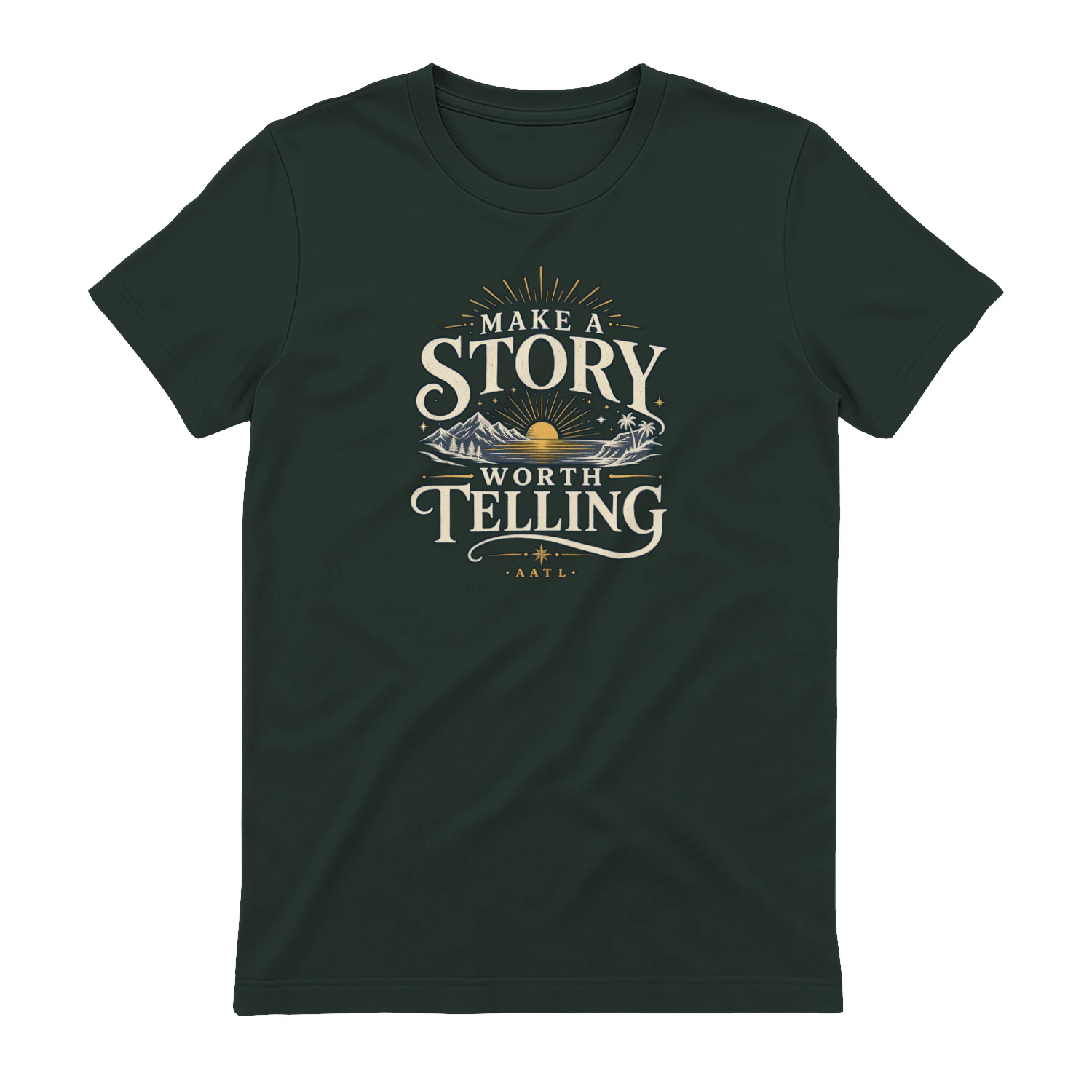
Make A Story Worth Telling
A scenic vintage-inspired design that encourages you to “Make A Story Worth Telling.” Mountains, water, sunset, and tropical details give it an adventurous feel that’s perfect for travelers, explorers, and anyone who wants a life filled with moments worth remembering.